
Liyan it Responsive Slider
Liyanit Responsive Slider is built using WordPress coding standards and accessibility best practices. It provides administrators with a dedicated slider manager, drag-and-drop slide ordering, Media Library integration, shortcodes, and Gutenberg block support.
Liyanit Responsive Slider is a lightweight and easy-to-use WordPress plugin that helps you create beautiful, responsive sliders for your website without requiring any coding knowledge.
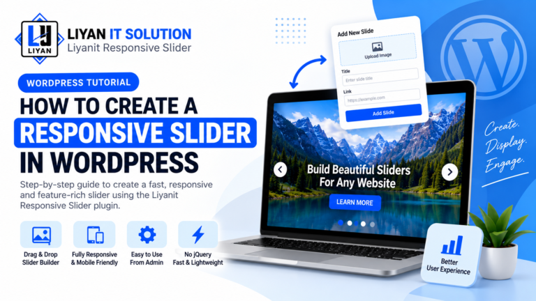
Create and manage multiple sliders directly from your WordPress admin panel. Add images, titles, descriptions, buttons, and other content to your slides, and customize the slider according to your website’s design.
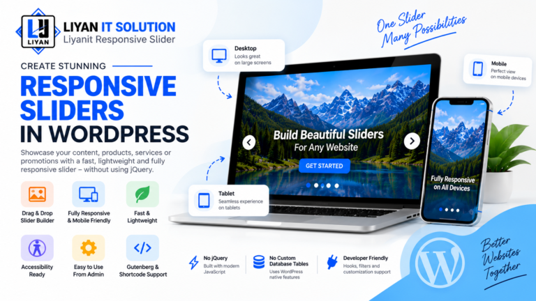
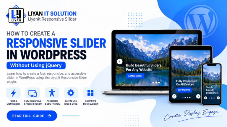
The plugin is fully responsive and works smoothly across desktop, tablet, and mobile devices. You can easily display your sliders anywhere on your website using a simple shortcode or the dedicated Gutenberg block.
Key Features
- Object-Oriented Architecture: Clean autoloading and modular class structure using the Liyan_GS\ResponsiveSlider namespace.
- WordPress Native: Uses a Custom Post Type (
liyan_gs_slider) and post meta without creating custom database tables. - Accessibility Features: Keyboard navigation, ARIA attributes, visible focus states, pause on hover/focus, and prefers-reduced-motion support.
- Conditional Assets: Loads frontend CSS and JavaScript only when a slider is rendered.
- Developer Hooks API: Provides action and filter hooks for custom extensions.
- Gutenberg Support: Insert and configure sliders directly from the WordPress Block Editor.
- Shortcode Support: Display sliders anywhere shortcodes are supported.
- Template Overrides: Customize slider markup from your active theme without modifying plugin files.
How to Use
- Upload the
liyanit-responsive-sliderdirectory to/wp-content/plugins/. - Activate the plugin through the Plugins menu in WordPress.
- Navigate to WordPress Admin → Sliders to create your first slider.
- Copy the shortcode
[liyan_gs_slider id="123"]and add it anywhere on your website, or select the Liyanit Responsive Slider block in the Gutenberg editor.
- Upload the
liyanit-responsive-sliderdirectory to/wp-content/plugins/. - Activate the plugin through the ‘Plugins’ menu in WordPress.
- Navigate to WordPress Admin Sliders to create your first slider.
- Copy the shortcode
[liyan_gs_slider id="123"]or select the Liyanit Responsive Slider block in Gutenberg block editor.
How do I display a slider on my site?
You can insert a slider using shortcode [liyan_gs_slider id="YOUR_SLIDER_ID"] into any page, post, or widget area. Alternatively, if you are using the Block Editor (Gutenberg), search for the Liyanit Responsive Slider block and select your desired slider.
Can I override the default slider template in my theme?
Yes! Copy the template file from `wp-content/plugins/liyanit-responsive-slider/public/views/slider-template.php` to your active theme folder at `wp-content/themes/your-theme/liyanit-responsive-slider/slider-template.php`. Do not modify the plugin's original template file, because your changes may be lost when the plugin is updated.
Is jQuery required on the frontend?
No. The frontend slider script uses vanilla JavaScript and does not require jQuery or other external frontend JavaScript libraries.
Does the plugin create custom database tables?
No. The plugin uses the WordPress Custom Post Type liyan_gs_slider and WordPress post meta instead of creating custom database tables.
Does the slider support accessibility features?
Yes. The slider includes keyboard navigation, ARIA attributes, visible focus states, pause behavior for hover and focus, and support for the user's prefers-reduced-motion preference.
Great slider plugin! It is easy to set up and works perfectly on desktop, tablet, and mobile devices.
Very simple and lightweight plugin. The slider looks clean and professional on our website.
Good responsive slider with useful customization options. Easy to integrate and configure.
Really impressed with how smoothly the slider works. The responsive layout is excellent.
Easy to use and works exactly as expected. Great plugin for creating responsive sliders.
No changelog entries yet.
Key Features

Create and manage multiple responsive sliders for your website.

Sliders automatically adapt to desktop, tablet, and mobile screen sizes.

Customize slider settings, layouts, images, text, and navigation options with ease.

Add images, titles, descriptions, buttons, and other content to your slides.

Create engaging sliders with smooth and attractive slide transition effects.

Configure slider width, height, spacing, navigation, and other display settings.
Screenshots