How to Create a Responsive Slider in WordPress Without Using jQuery
A responsive slider can be a great way to showcase featured content, products, services, images, promotions, or important announcements on a WordPress website. However, many slider solutions depend on large JavaScript libraries or third-party frameworks that can affect website performance.
Liyanit Responsive Slider provides a lightweight solution for creating responsive sliders directly from the WordPress dashboard.
Why Use a Responsive Slider?
Modern websites need to work properly across desktops, tablets, and mobile devices. A slider should automatically adapt to different screen sizes while keeping images and content easy to view.
A responsive slider can help you:
- Showcase featured images and content
- Highlight products or services
- Display promotions and announcements
- Improve visual presentation
- Create interactive homepage sections
- Provide a better experience on mobile devices
A Lightweight Slider Solution
Liyanit Responsive Slider is built using WordPress coding standards and a modular architecture. The plugin uses vanilla JavaScript on the frontend, which means it does not require jQuery.
This can help keep the frontend implementation lightweight and reduce unnecessary dependencies.
Create Sliders From the WordPress Admin
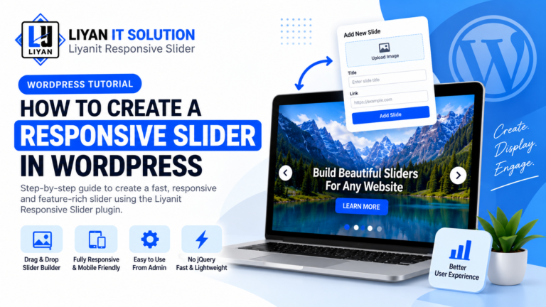
The plugin provides a dedicated slider management interface in the WordPress Admin.
You can create and manage slider content without manually editing code or creating custom database tables.
The drag-and-drop editor makes it easier to arrange slides according to your requirements.
Add Your Slider Using a Shortcode
Once your slider has been created, you can display it anywhere shortcodes are supported.
For example:
[liyan_gs_slider id="123"]Simply replace 123 with your Slider Post ID.
This makes it possible to use the same slider on different pages or sections of your website.
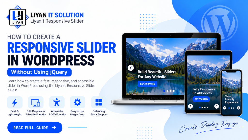
Responsive on Different Devices
A responsive slider should provide a consistent experience regardless of the visitor’s device.
Liyanit Responsive Slider is designed to support desktop, tablet, and mobile layouts, making it suitable for modern responsive websites.
Control Slider Settings
The shortcode also supports different attributes that allow you to customize how a slider behaves.
For example:
[liyan_gs_slider id="123" autoplay="true" speed="5000" navigation="true" pagination="true"]You can control options such as:
- Autoplay
- Transition speed
- Navigation arrows
- Pagination dots
- Number of visible slides
- Spacing between slides
- Custom CSS classes
Conclusion
A responsive slider doesn’t need to be complicated or dependent on large frontend libraries. With Liyanit Responsive Slider, WordPress users and developers can create responsive sliders, manage slides from the dashboard, and display them using a simple shortcode.
If you are looking for a lightweight WordPress slider solution with responsive behavior and vanilla JavaScript support, Liyanit Responsive Slider can be a useful option.